(redUX = redesign UX • re-do • ˌriːˈduː)
The PDF Printover tool worked. That was the problem.
When a tool technically functions, it rarely gets prioritised for improvement, no matter how much friction it creates for the people using it every day. At GoodX, that friction was felt most acutely by the support staff responsible for building hundreds of fillable PDF forms during client onboarding. Every new clinic meant a new library of forms. Every form meant navigating a dense, unintuitive interface with no field organisation, no styling shortcuts, and no way to quickly find a field on the PDF.
The tool worked. But it was slow, frustrating, and completely unscalable.
The question became the same one I bring to every project at GoodX: "What's the smallest change that creates the biggest shift for the user?"/
Project overview
| Company | GoodX Healthcare, a practice management platform for clinics across Canada, South Africa and many other countries |
| My role | Product Designer, sole designer, end-to-end: heuristic evaluation, SME research, concept, iteration, prototyping, stakeholder presentation |
| Team | Canadian CEO (sponsor), Canadian and South African support staff and SMEs |
| Timeline | November 2024 to March 2025 |
| Platform | Web application (desktop) |
The before state
The tool has two modes: template building (creating the form once) and form completion (using it during a patient consultation). The people who felt the most pain were support staff building templates at scale, sometimes hundreds of forms per client onboarding.
The original interface made that slow and error-prone:
- No field organisation. A flat, unsorted list that broke down completely on complex forms.
- No field states. No visual difference between a default, active, or locked field on the PDF or in the panel.
- No locate function. With 15+ fields, there was no way to map a panel entry to its field on the PDF.
- Styling changed field by field. Changing the font across a 20-field form meant opening and editing each field individually.
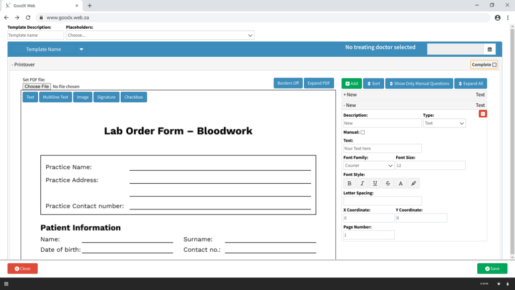
- No empty state. Opening the tool showed a blank screen with no guidance on where to start.
The business cost: Six existing support tickets from Canadian and South African users documented specific pain points that had gone unaddressed. The Canadian CEO raised PDF Printover's usability as a direct barrier to efficient client onboarding at the product roadmap meeting.
What the research told us
Usability testing wasn't feasible — the tool's complexity made a testable prototype difficult to produce quickly. Research ran through heuristic evaluation, structured SME feedback sessions with Canadian and South African support staff, and a systematic review of all 6 existing Odoo support tickets.
- Form building was the primary pain point, not form completion. Support staff building at scale felt the friction most.
- The flat field list broke down on complex forms. No grouping, no search, no way to navigate efficiently.
- Styling was the biggest time sink. No bulk action meant repetitive manual edits across every field.
- The locate function was the most-requested missing feature.
- All 6 support tickets were designable. 2 resolved directly in the redesign, 3 deferred to a next phase, 1 correctly identified as a code fix rather than a UX problem.
Design process
The structural change
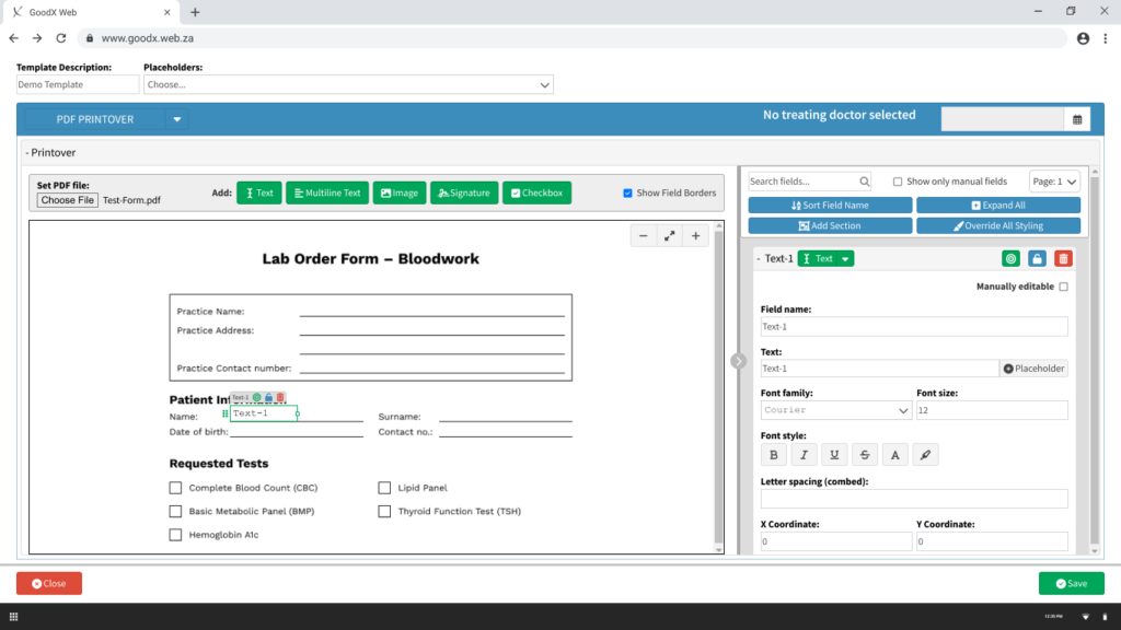
The most impactful decision: move fields into their own dedicated, collapsible side panel, clearly separated from the PDF view. This gave the PDF room to breathe and the fields panel room to be properly organised. The Add toolbar was consolidated, all five field type buttons grouped with a clear label, and zoom controls added to the PDF view.
Field states and interaction
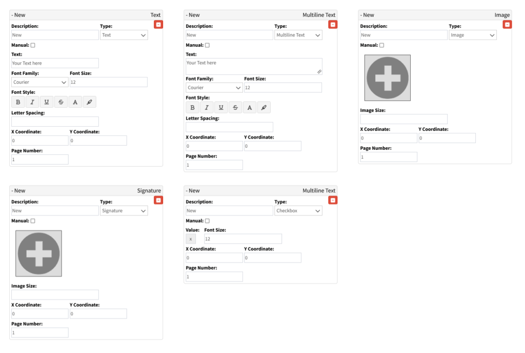
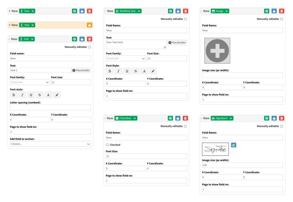
Every field type was redesigned with four distinct states: default (borders off), default (borders on), active, and locked, with appropriate cursor feedback at each state (pointer, move, resize). Field rows in the panel were restructured: auto-naming on creation (Text-1, Multiline-2), a field type dropdown for quick switching, and three colour-coded action icons, locate (green), lock (amber), delete (red), consistent across all field types.
The locate/sync function
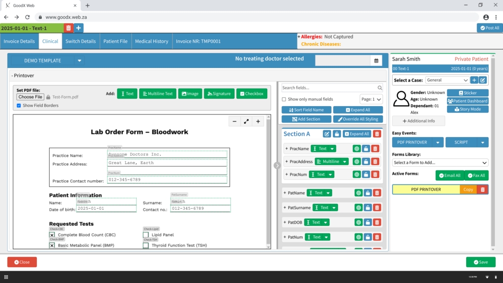
Clicking the locate icon on a field in the PDF expands and focuses it in the side panel, and vice versa. Two-way sync eliminates the core navigation problem on complex forms. Users always know exactly where they are.
Field placement
Clicking a field type button attaches a semi-transparent outline to the cursor. The user positions it on the PDF and clicks to place. Auto-named, immediately visible in the panel, ready to configure.
Sections and global styling
Sections introduce collapsible containers for grouping related fields, practice info, patient details, requested tests. Fields drag into sections in the panel, or are assigned via a dropdown within each field's settings.
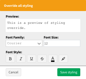
Override All Styling opens a focused dialog with a live preview and font controls applied to all unlocked fields simultaneously. What previously required editing 20 fields individually now takes seconds.
Feedback amendments
Four additions incorporated after SME review:
- Line height control for multiline text fields, critical for clinical forms where text density affects readability
- Developer mode toggle for Jinja templating, progressive disclosure keeping the interface clean for regular users while unlocking raw template syntax for developers
- Practice stamp shortcut for image fields, two options explored with honest trade-off notes on feasibility
- Field alignment tools, two solutions designed and presented
The solution
Template building: from slow to scalable
Split panel. Click-to-place fields. Auto-naming. Sections. Global styling. The core workflow that previously required navigating a cluttered single-column interface is now structured, fast, and repeatable at scale.
Form completion: in clinical context
The form completion experience lives inside the patient record, accessible directly from the clinical screen. Auto-populated fields pull in patient data. The two-way locate/sync function means clicking any field on the PDF immediately focuses it in the panel. No hunting, no guessing.
Outcomes & what I learned
None of these designs made it into the live product. The redesign was presented at the GoodX product roadmap meeting with the Canadian CEO's active advocacy, but was deprioritised by the broader stakeholder group due to competing development priorities, limited SA development resources, and a perception that the pain was felt by a small group of power users rather than the wider client base.
Same honest reality as the Task Screen. The design was validated. The organisational dynamics determined the outcome.
What the project achieved: All 6 Odoo tickets reviewed and addressed. SME feedback from staff across two countries incorporated into four specific amendments. The prototype reached full fidelity across both user flows, ready for development handoff.
What I'd measure if it shipped: Time to build a standard onboarding form template. Support escalations related to PDF Printover during client onboarding. Form completion time per consultation.
What I learned: The "maximum impact, minimum change" principle isn't just a design constraint — it's a communication strategy. Where the advocacy fell short was in making the aggregate cost of the status quo visible: not one support person struggling with one form, but every support person, on every form, for every client onboarded. Numbers move roadmaps. Interface critique moves designers.
Interactive prototype
(redUX = redesign UX • re-do • ˌriːˈduː)
Most software products have a graveyard. A screen nobody opens, a feature everyone quietly routes around. At GoodX, that screen was Tasks. Support tickets had dried up, not because the problem was solved, but because users had given up. They'd moved on to email threads and sticky notes rather than fight with a screen that didn't work for them.
When the Canadian CEO flagged the Task Screen as a barrier to market readiness, the brief was simple: find out why nobody uses this, and fix it. Working within GoodX's development realities, I'd learned to ask a sharper question: not "what's the best possible design?" but "what's the smallest change that creates the biggest shift for the user?" That discipline (maximum impact, minimum change) became the lens for every decision on this project.
Project overview
| Company | GoodX Healthcare, a practice management platform for clinics across Canada, South Africa and many other countries |
| My role | Product Designer, sole designer, end-to-end: research, concept, iteration, prototyping, stakeholder presentation |
| Team | Canadian CEO (sponsor + user tester), 1 Canadian client, 1 support specialist, 2 SA SMEs (Subject Matter Experts), 2 SA clients, 1 junior UX designer (SA facilitation) |
| Timeline | June 2023 to February 2025, 4 major versions |
| Platform | Web application (desktop) |
The before state
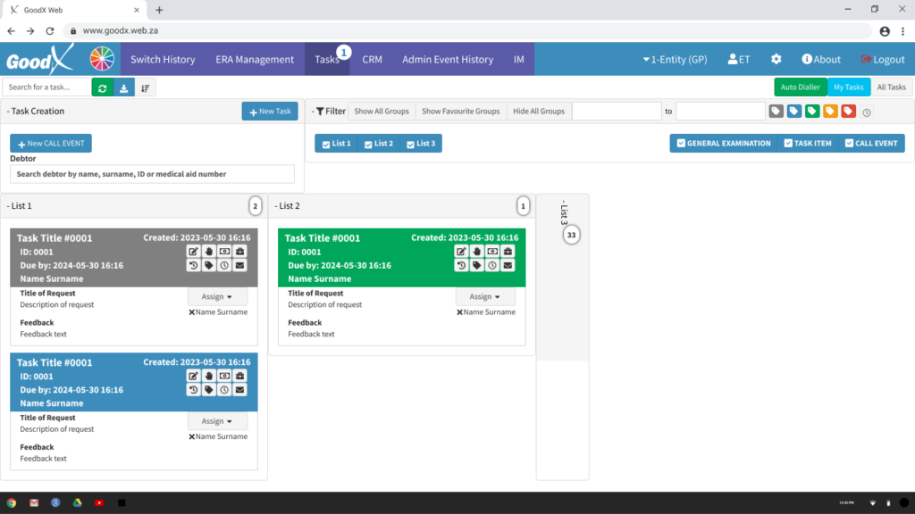
The original Task Screen — unnamed list tabs, unlabelled icon arrays, no priority or urgency signalling, and colour with no consistent meaning. This is the screen most users had quietly abandoned before the redesign began.
The problem
The Task Screen existed. Users didn't use it. Support tickets about it had stopped, not a sign of success but of resignation.
The original Kanban board presented every function at the same visual weight: primary actions, secondary controls, metadata, and filters all competing equally for attention. Task cards were dense with raw data (ID numbers, timestamps, six unlabelled icons) and gave users no way to tell at a glance what was urgent, overdue, or needed action today. The result was decision paralysis before anyone had even started working.
The business cost: Clinical teams were managing workflows through email threads and verbal handoffs, creating accountability gaps and making GoodX harder to position as a complete solution for the Canadian market.
What the research told us
We ran unmoderated testing in Canada (CEO, 1 client, 1 support specialist) and remote moderated sessions in South Africa (2 SMEs, 2 clients). Seven participants across two countries, remarkably consistent findings.
- The feature had been abandoned, not just struggled with. Users had already written it off before we started.
- Visual equality created decision paralysis. Everything competed for attention, so users froze.
- Cards showed too much and communicated too little. Empty fields cluttered cards; priority and urgency were invisible.
- Task creation felt like form-filling. Unclear required fields, and a "complete" checkbox at creation that confused every single participant.
- The status model was abstract. Users thought in terms of done / waiting / urgent, not system labels.
Design process
Before the constraint: V1 (June 2023)
The first version redesigned the existing Kanban board and introduced a new List View from scratch, drawing on established task management patterns from Monday.com and ClickUp. The Kanban got a consolidated toolbar, a four-level priority system (Low / Normal / High / Urgent), inline card editing, and a redesigned New Task form with clear required/optional field separation. The List View gave users an alternative to the board for managing high task volumes.
Testing validated the direction, but also exposed that the Kanban still lacked strong enough visual hierarchy for quick triage, and the status grouping wasn't opinionated enough.
After the constraint: V2 through V4 (September 2024 to February 2025)
After v1, a new constraint arrived from the SA CEO: rather than build a dedicated list view, the Task Screen would need to use GoodX's existing List View architecture, a general-purpose data table framework used across the platform. The development investment already made in it was too significant to justify a parallel build.
The constraint was significant. Adapt a data table into a task management tool, without touching the underlying architecture. It meant solving a design problem with one hand tied behind my back, finding out exactly what's possible when visual design and interaction choices are your only tools.
The answer was almost entirely visual: row colour to communicate priority and urgency at a glance, bold red for overdue tasks, de-emphasised rows for completed ones, and a locked sort order (status first, then due date) to give users a predictable reading order every time. The sidebar, an existing List View component used elsewhere in the platform, was repurposed as a task quick-view, letting users act on tasks without losing their place in the list.
V3 and V4 refined both views based on further testing and SME feedback, and overhauled the New Task form, including the removal of the "complete" checkbox that had confused every participant across both countries.
The solution
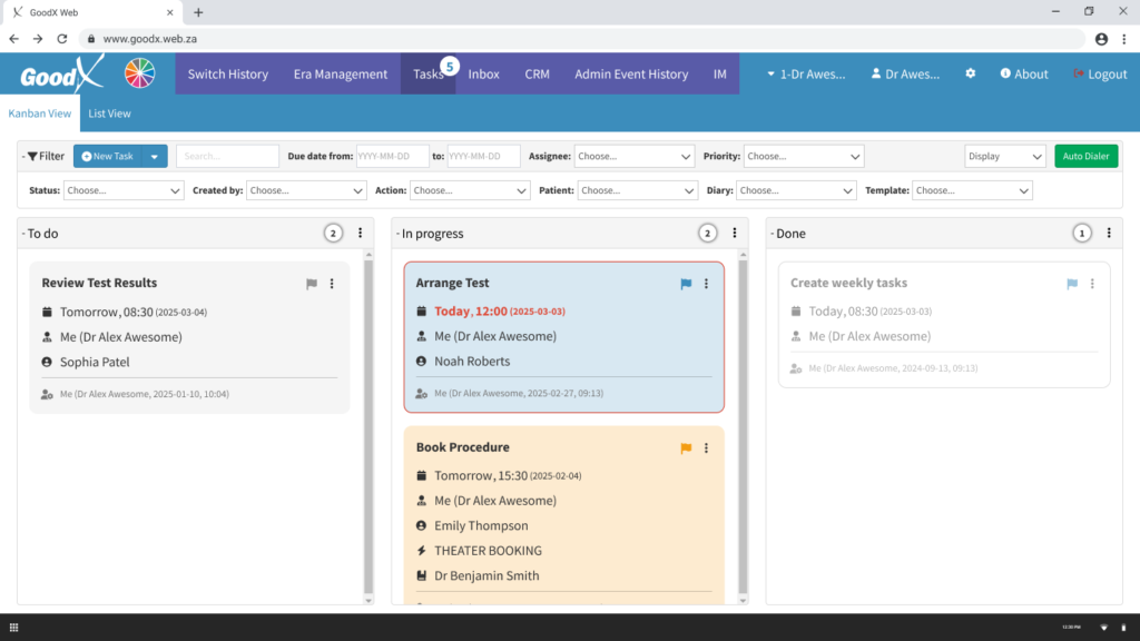
Kanban: from noise to signal
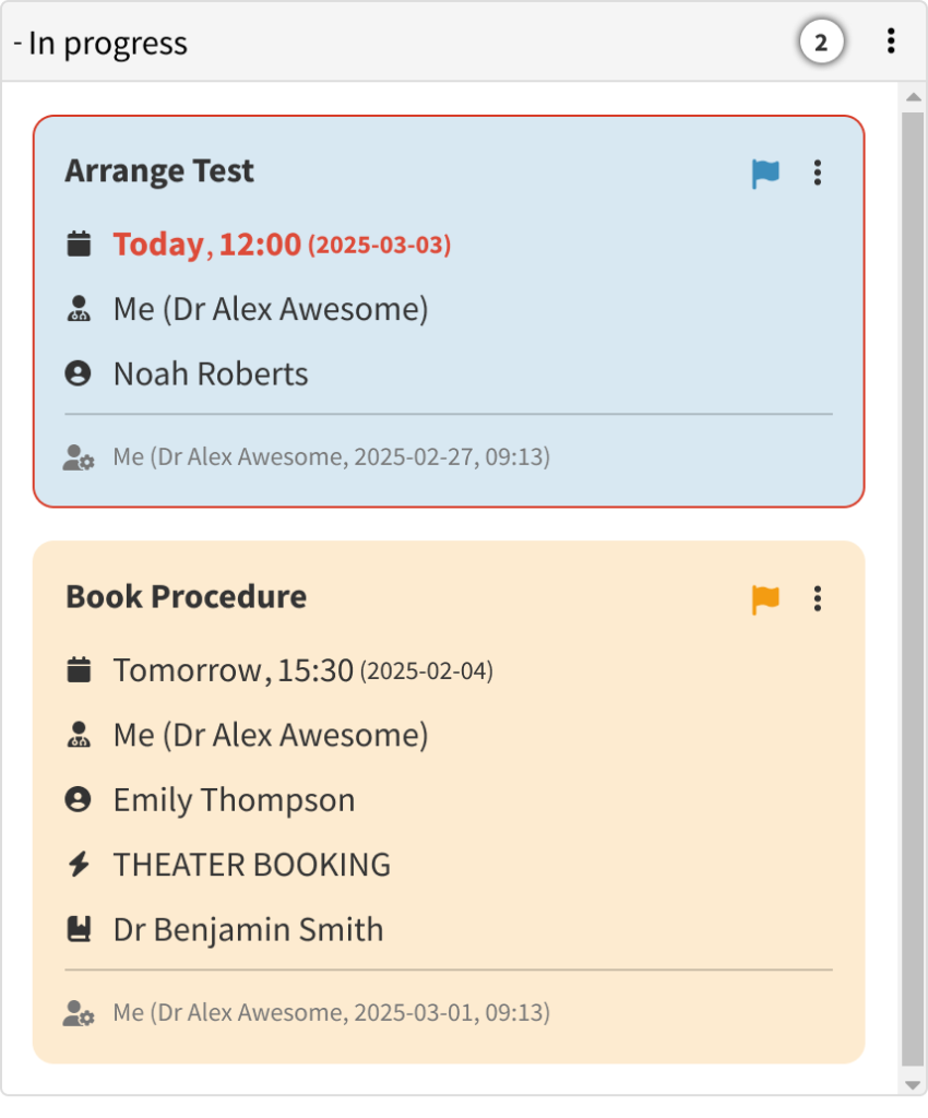
Status columns mirror real clinical workflow. The toolbar collapses when not needed. Task cards show only populated fields. Overdue tasks surface with a red border and highlighted due date; high-priority tasks carry an amber background. Users see what needs attention the moment they open the screen.
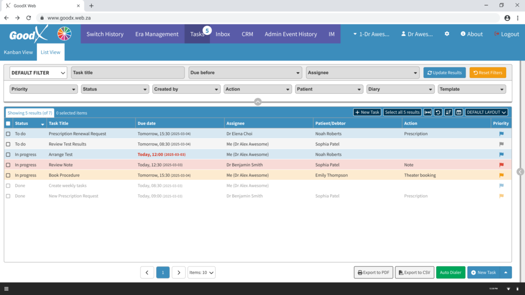
List view: a data table, made useful
Working entirely within the existing architecture, visual design did the heavy lifting: row colour for priority and status, bold red for overdue, a predictable sort order, and a collapsible filter toolbar that keeps the task list the dominant visual element.
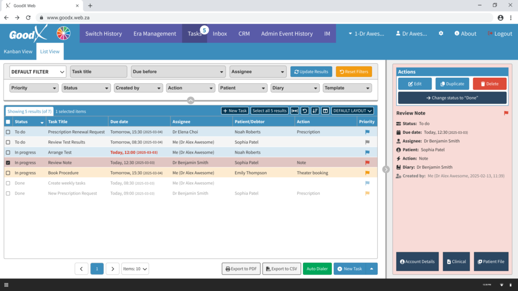
The sidebar surfaces full task details and primary actions, including a prominent "Change status to Done", without navigating away from the list.
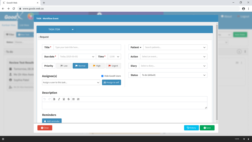
New Task: delegation, not form-filling
Required fields are marked and prominent. Priority is a one-click segmented control, Normal pre-selected. "Assign to self" handles the most common assignee in one click. The "complete" checkbox is gone.
Outcomes & what I learned
None of these designs made it into the live product. The SA development team introduced a List View to the Task Screen, implemented as a plain data table without the visual hierarchy, colour coding, or sidebar that testing had validated. The Kanban redesign and New Task form remained unimplemented. The Canadian CEO endorsed the direction and participated in user testing himself, but implementation priority rested with a development team focused on other roadmap items.
This is a common story in organisations still building their UX culture, and an honest one worth telling.
What the project achieved: Seven participants across two countries validated every major design decision through observed testing. The v4 prototype reached development-ready status with Canadian CEO sign-off. Four versions of annotated prototypes leave a complete rationale trail for whoever picks this up next.
What I learned: In a low-UX-maturity environment, the most valuable design question isn't "what's the ideal solution?" It's "what's the smallest change that creates the biggest shift for the user?" The List View constraint forced exactly that discipline: no new architecture, no rebuilt components, just visual design and interaction choices. It turned out to be enough to make a data table feel like a task manager.
That's a lesson I'll carry into every project I work on next.