Seeing something wonky on the site? Sorry about that, it's new. I'm working on it...

hello world!
The myGC Revamp
Modernizing GoodX's patient booking app, from outdated foundation to shipped redesign
Modernizing GoodX's patient booking app, from outdated foundation to shipped redesign
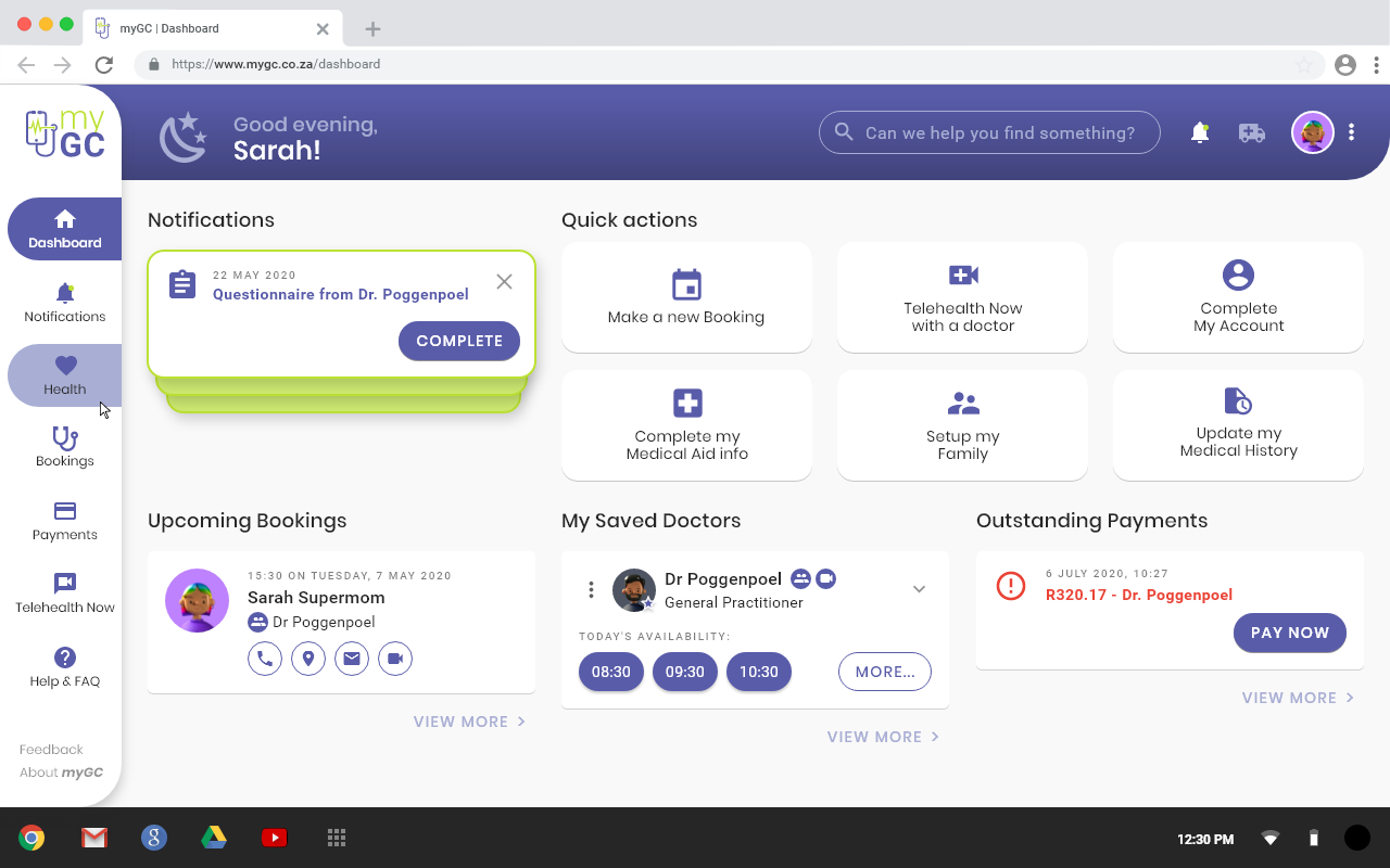
myGC is a free web app patients use to find and book an appointment with a doctor near them. It started in South Africa and is now used wherever GoodX operates internationally. I was the sole UX/UI designer on its 2020 redesign, working alongside the CEO, a development manager, project managers, a business analyst, and a development team of around ten.
The original app was built for a fast release in 2017 and never revisited. By 2020 it had scalability and stability problems, an outdated interface, and process flows that hadn't kept pace with the product. The breaking point was Telehealth: a feature that became critical during COVID, and one the old app's foundation couldn't support. GoodX assembled a small team to rebuild the app from the ground up.
This is one of the few projects on this site that shipped end to end, brand, information architecture, screens, and developer handoff, all the way to a live product used by real patients.
| My role | Sole UX/UI Designer |
| Team | CEO (Product Owner), Development Manager (CIO), Project Managers, ~10 Developers, Business Analyst, Marketing/Documentation team |
| Timeline | 2020. Design phase ran 1 to 2 months, development took a similar length, launched June 2020 |
| Platform | Web app, mobile and desktop |
| Status | Shipped |
The old app was functional but showing its age everywhere: dated visuals, inconsistent layout, and no clear path to add features the product actually needed.
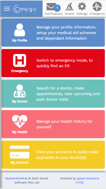
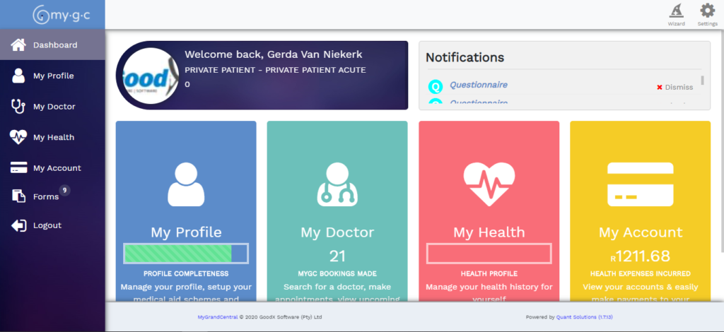
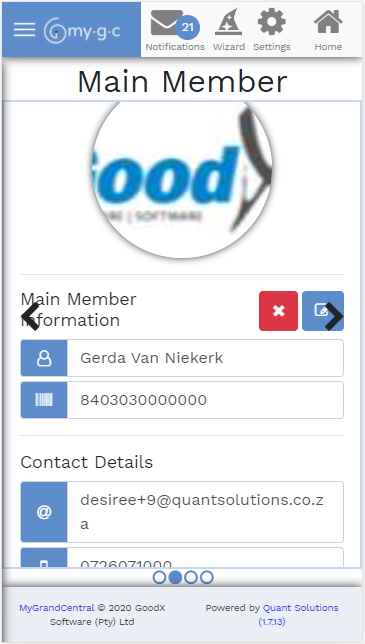
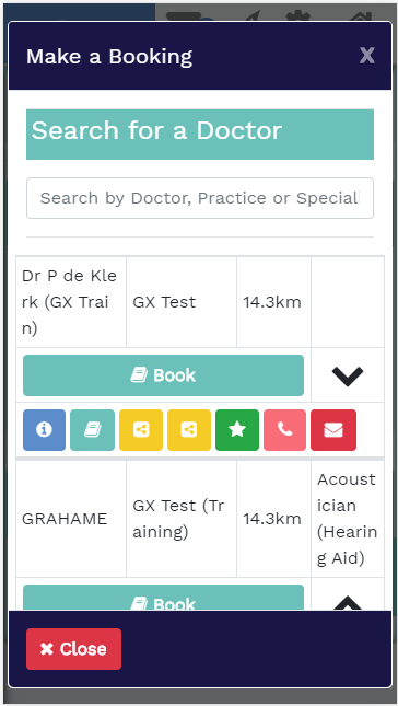
Stakeholders needed a modern interface that could support new functionality, most urgently Telehealth, and get it to market fast enough to matter during COVID. There was no time to bolt fixes onto the old foundation. The only real option was a full rebuild: brand, information architecture, and every screen.
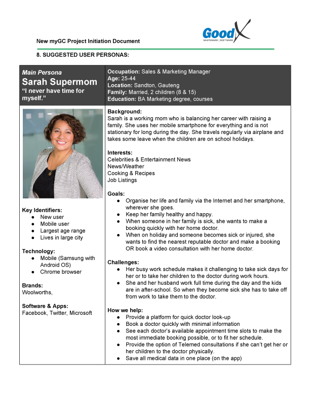
I built three personas from real Google Analytics data to understand who was actually using the app and how. I also researched Material Design as a visual language to base the new UI on, aiming for something clean and current without losing the elements that made the product recognizably myGC.
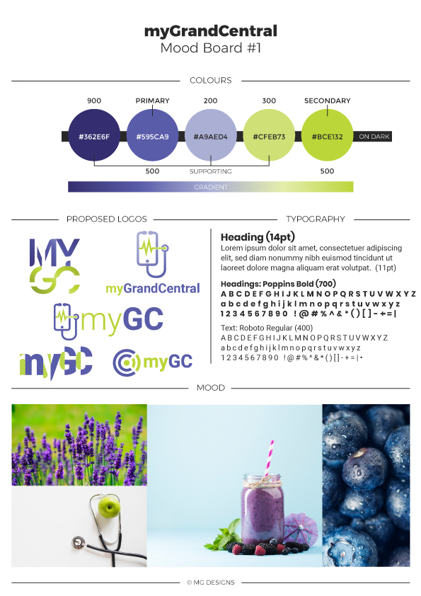
Before touching any screens, I established the visual language the whole redesign would run on: logo, colour palette, and moodboard.
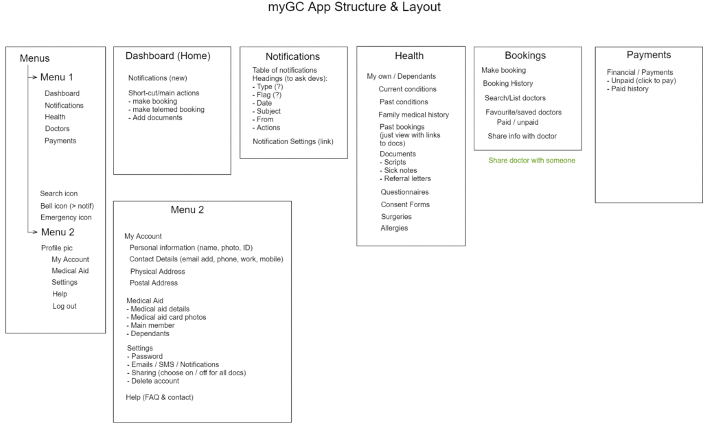
I restructured the app's functions and features to be more intuitive and better organized, working through it collaboratively with the team in Excalidraw.
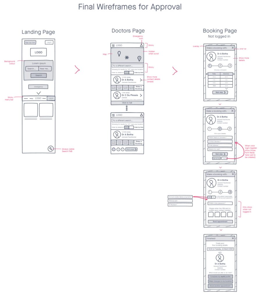
I built low-fidelity wireframes for each major part of the app, reviewed them with the team and stakeholders, and revised iteratively as we agreed on flows.
Wireframes became hi-fi screens in Adobe XD, styled to the new brand and informed by the Material Design research.
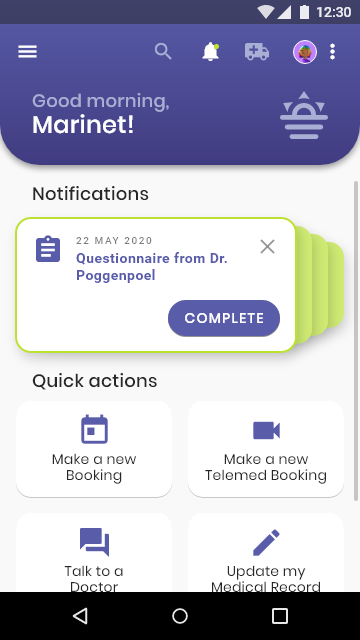
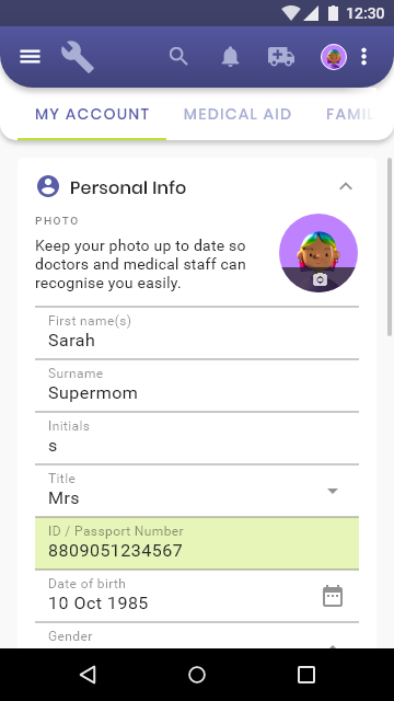
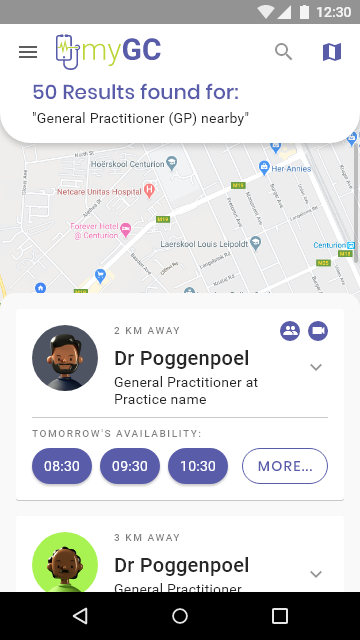
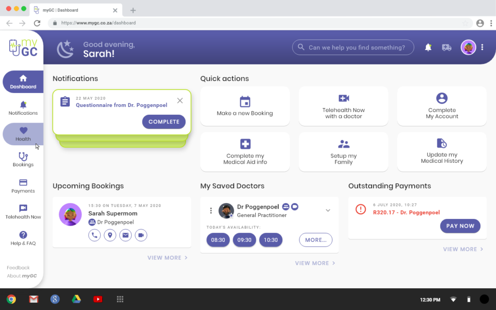
I handed off 235 mobile and desktop screens to the development team through Zeplin (zpl.io/bLQeZ1Y). There were loads of iteration as I spotted irregularities in design, as well as when we held weekly meetings to discuss user flows and technical constraints.
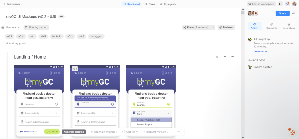
Most of the exact styling I designed didn't make it into the finished product untouched, mostly small things like spacing and font size that drifted screen to screen. This was my first major UI/UX project and myGC didn't have a design system yet, so there was nothing to hold ten developers, working on different parts of the app at the same time, to one consistent standard. I kept padding and spacing consistent on my end and designed to pixel precision, but the team was instructed to prioritize functionality over matching the design exactly, and that's what shipped.
It's a big part of why I'd want a design system in place before taking on something this size again.
The core red route: a patient finding a doctor and completing a booking.
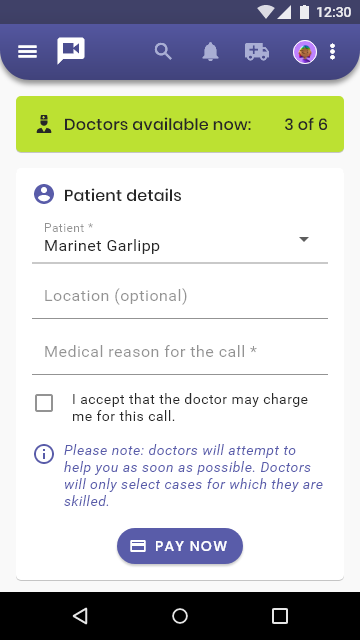
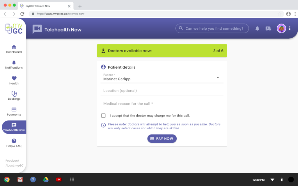
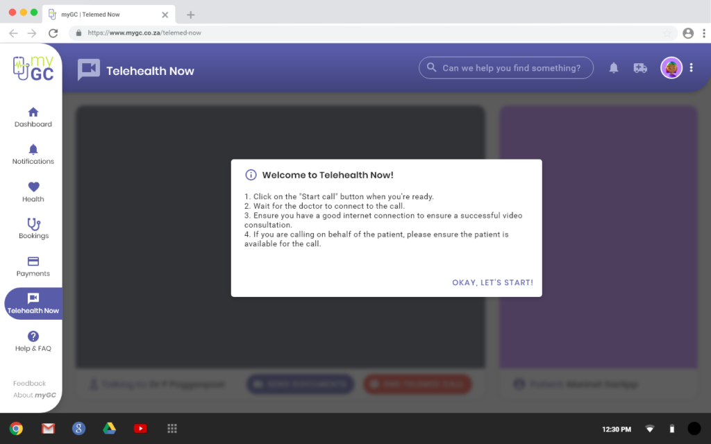
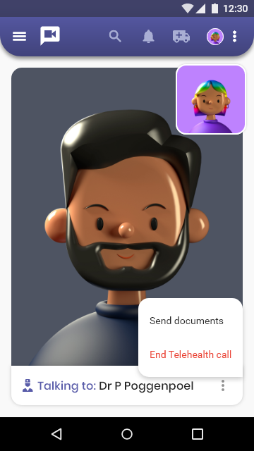
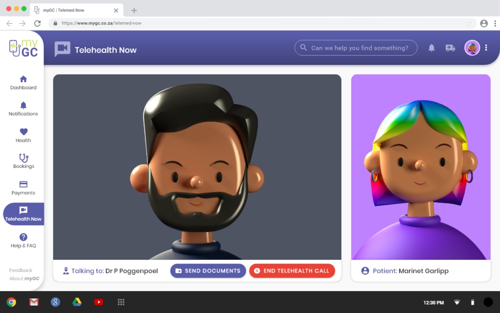
Telehealth was the feature the old app's foundation couldn't support, and the reason this redesign happened in the first place. It works from both mobile and desktop.
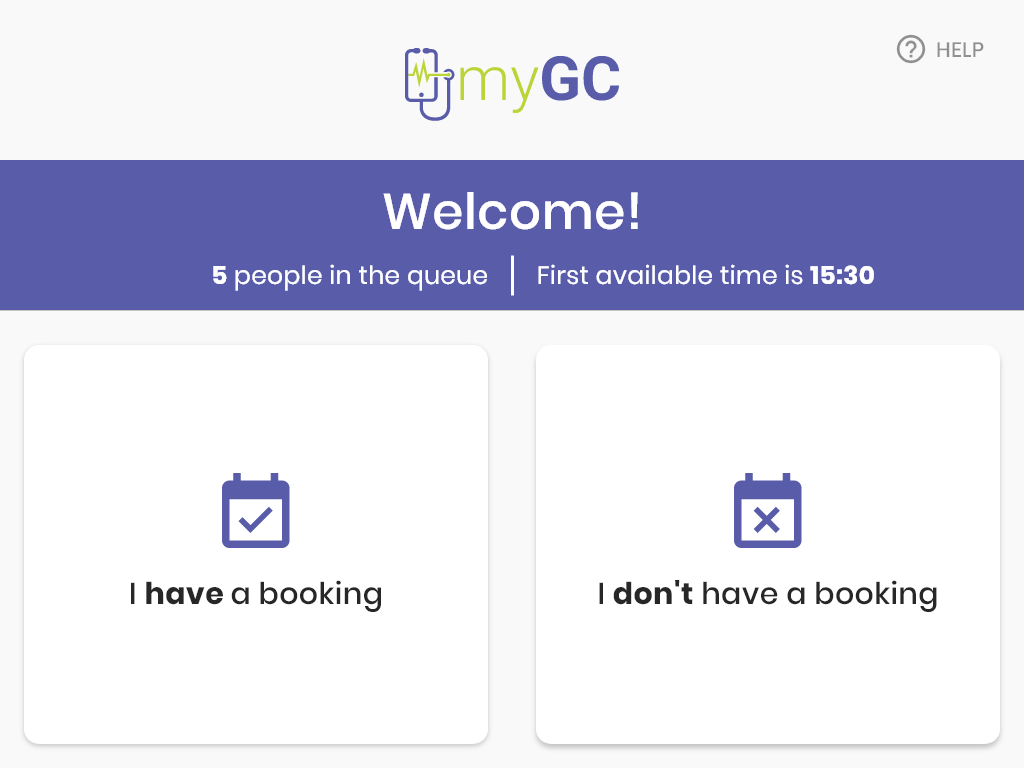
myGC also runs on an in-clinic kiosk, so patients who walk in can check in or book without a receptionist. The flow is built around one branch point: do you already have a booking, or not.
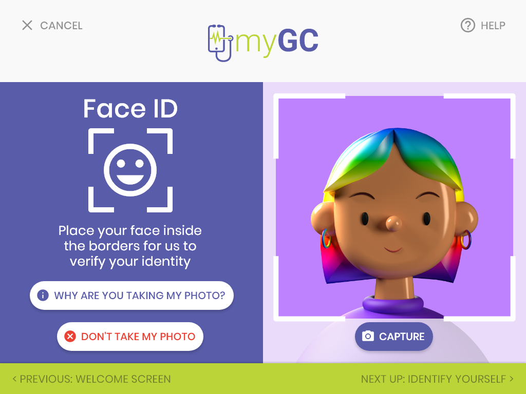
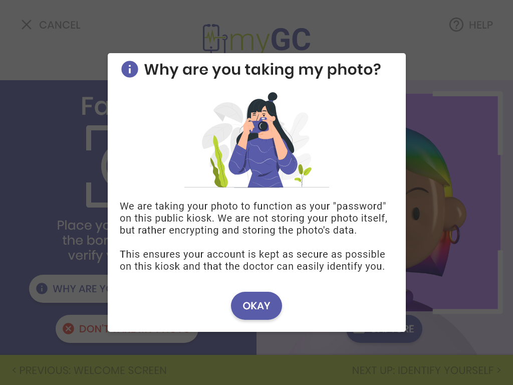
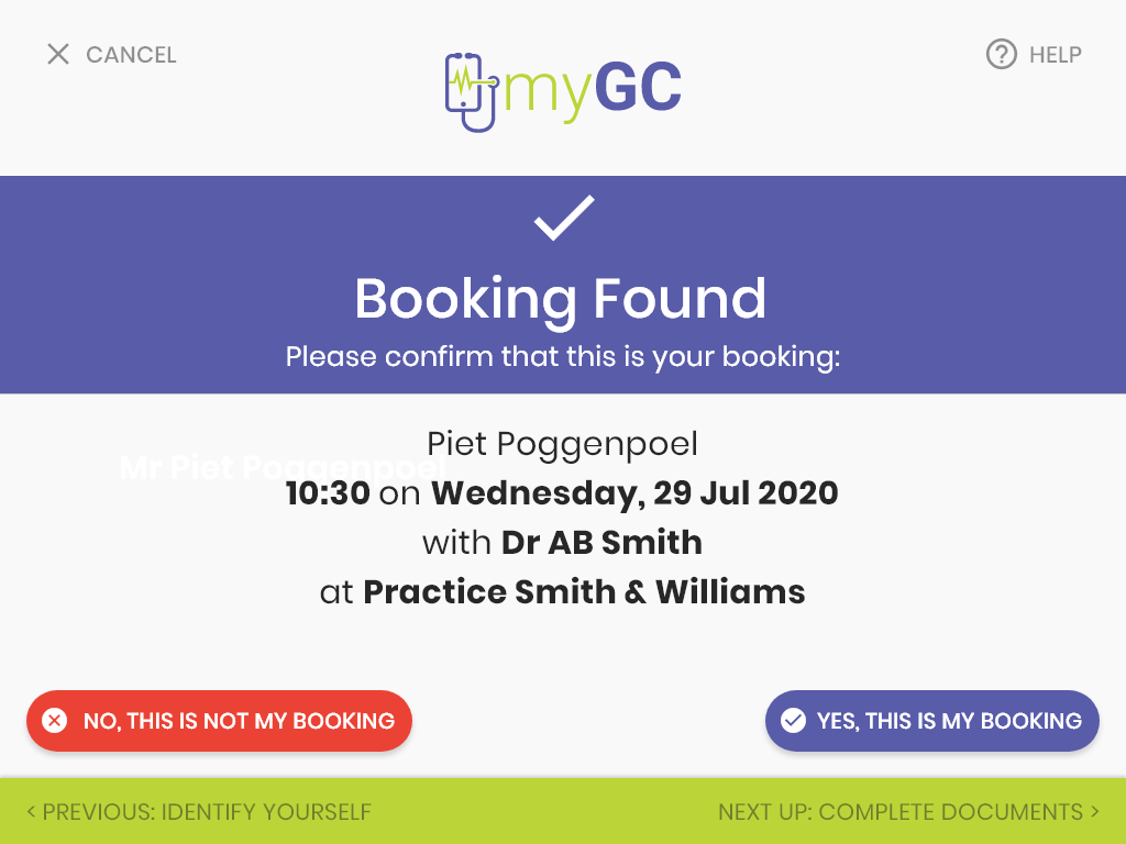
For a patient who already has a booking, the kiosk confirms it, runs through any outstanding documents, and checks them in.
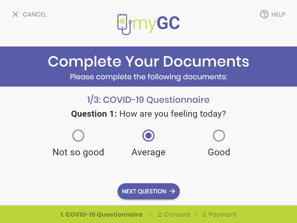
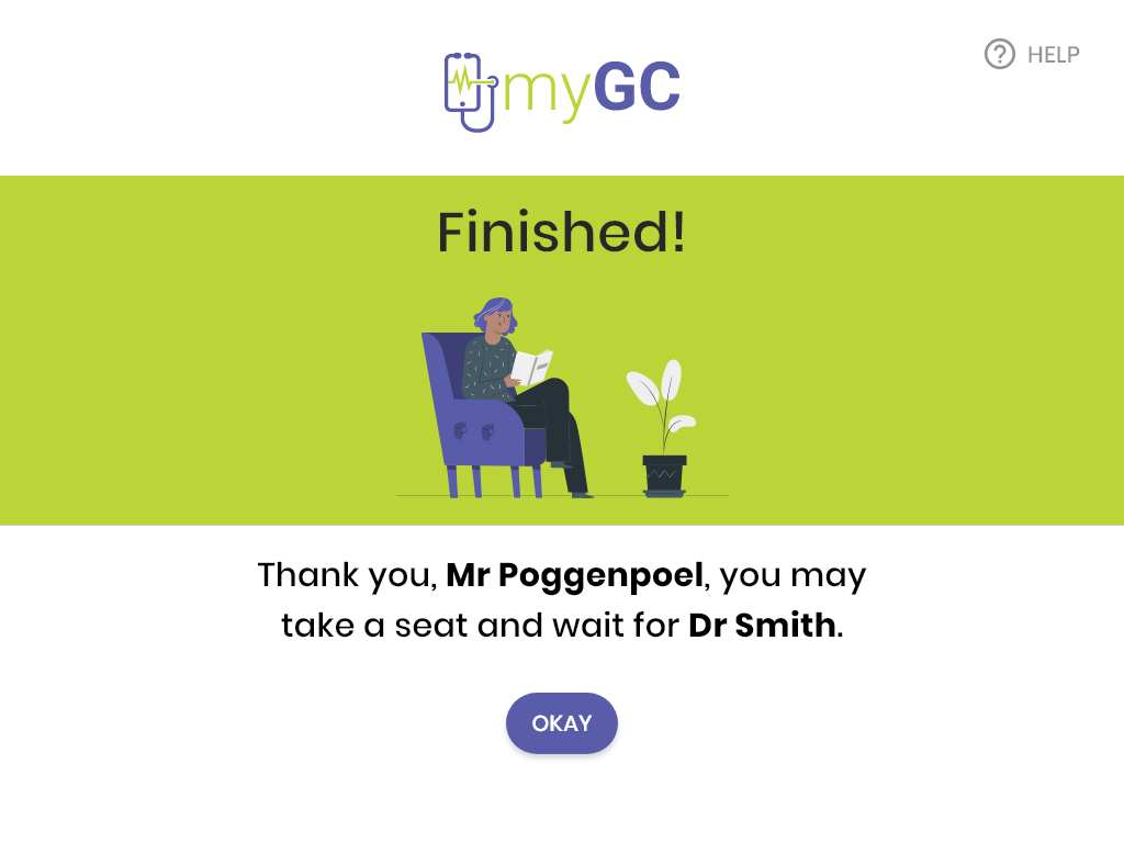
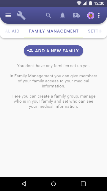
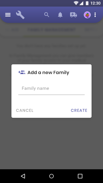
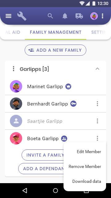
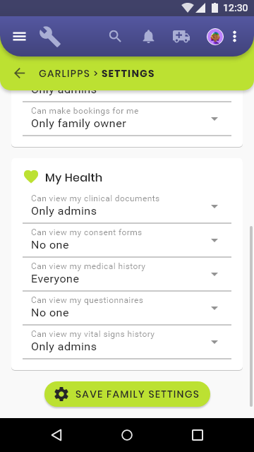
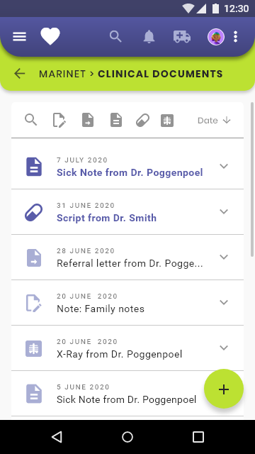
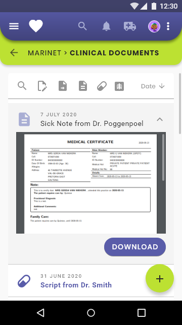
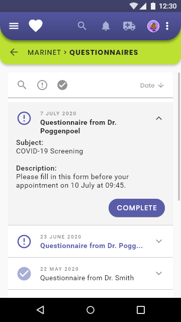
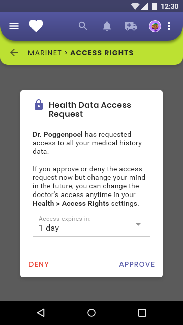
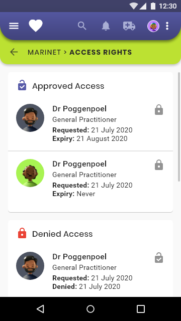
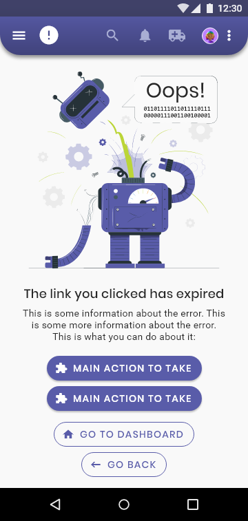
A handful of other screens that show the range of what shipped: family and dependant management, clinical document history, doctor access control, and even the error states.
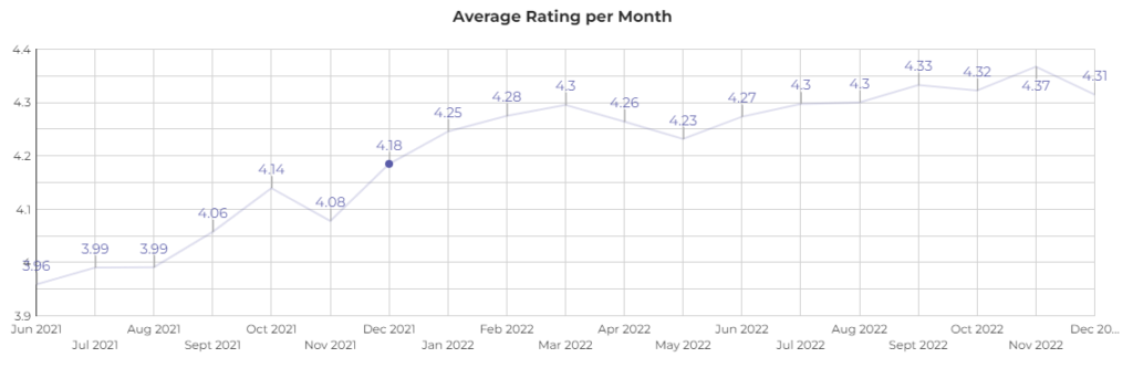
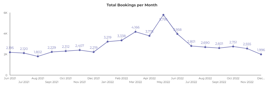
In November 2021, patient feedback ratings (captured after every booking) dropped sharply. The pattern was clear in the comments: people were struggling to make a booking.
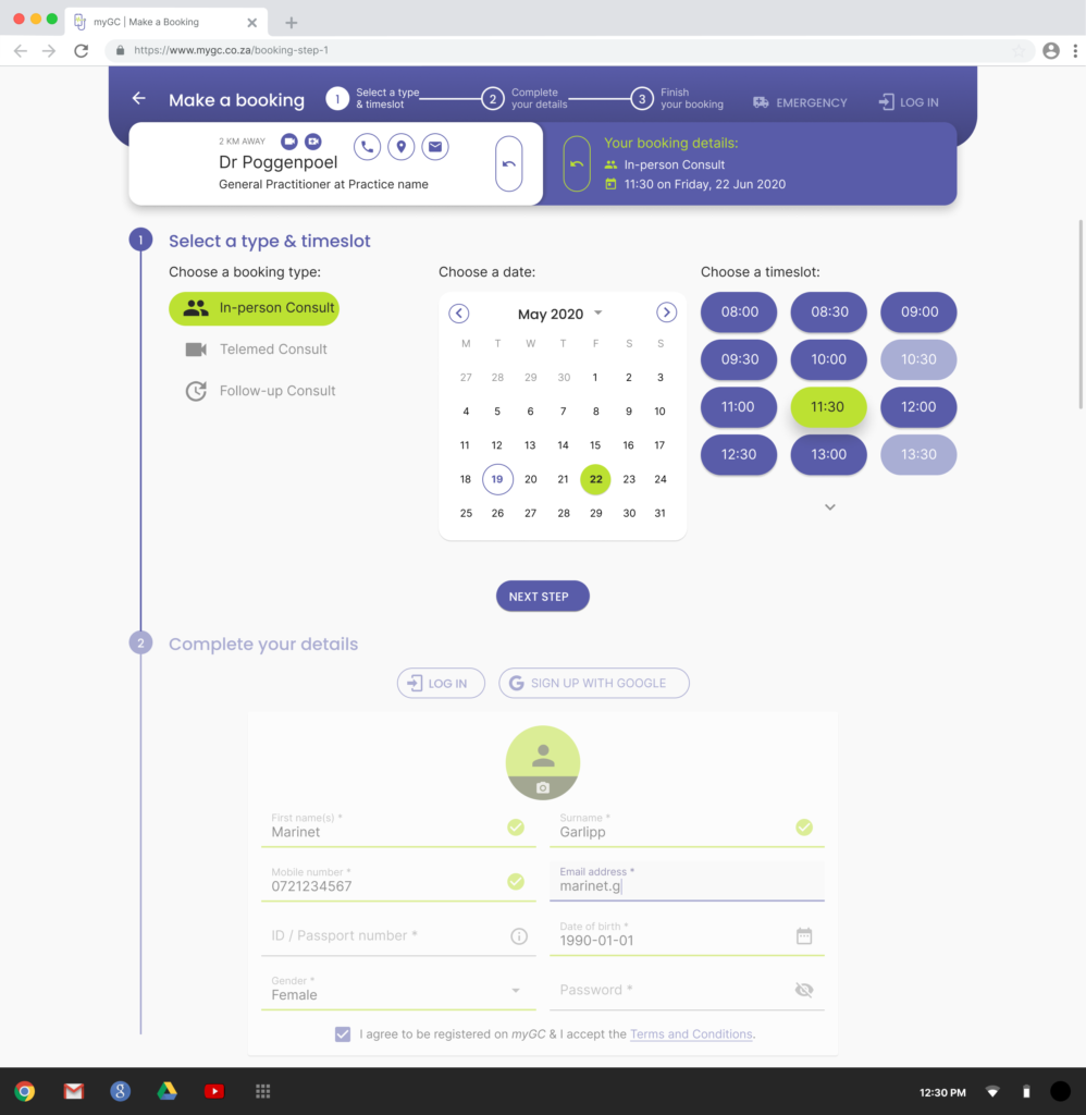
Two problems stood out. The screen confused who was making the booking with who the booking was for, a parent booking for their child, for example, had no clear way to express that. And the medical aid details step read as required even though it wasn't; the message saying it was optional was easy to miss and badly worded.
The brief from the CEO was narrow on purpose: a UI fix, minimal engineering or process change, fast turnaround.
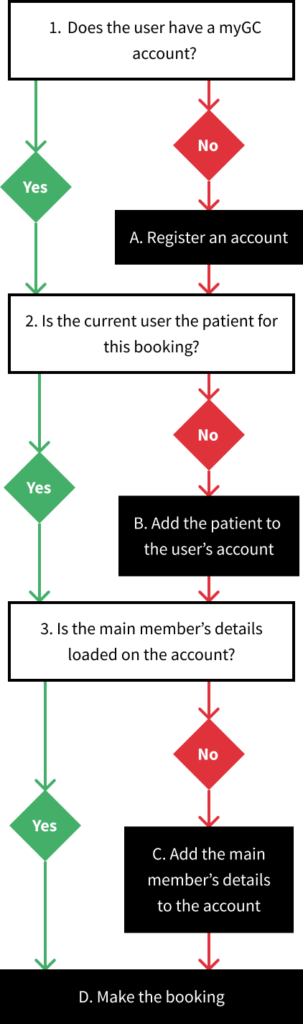
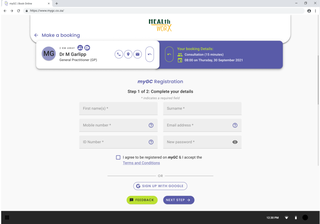
I broke the existing screen into a basic flow, then designed each decision point on its own: does the user have an account, are they the patient, is the main member's information already on file, then the booking itself. This is where the signed-out booking flow you flagged earlier lives, it splits into creating a new account mid-booking or signing back into an existing one.
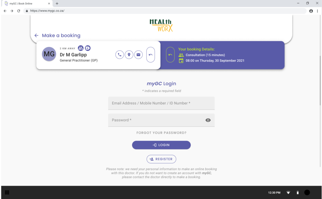
Show Image Creating an account without leaving the booking flow
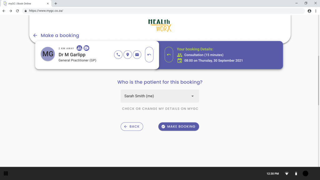
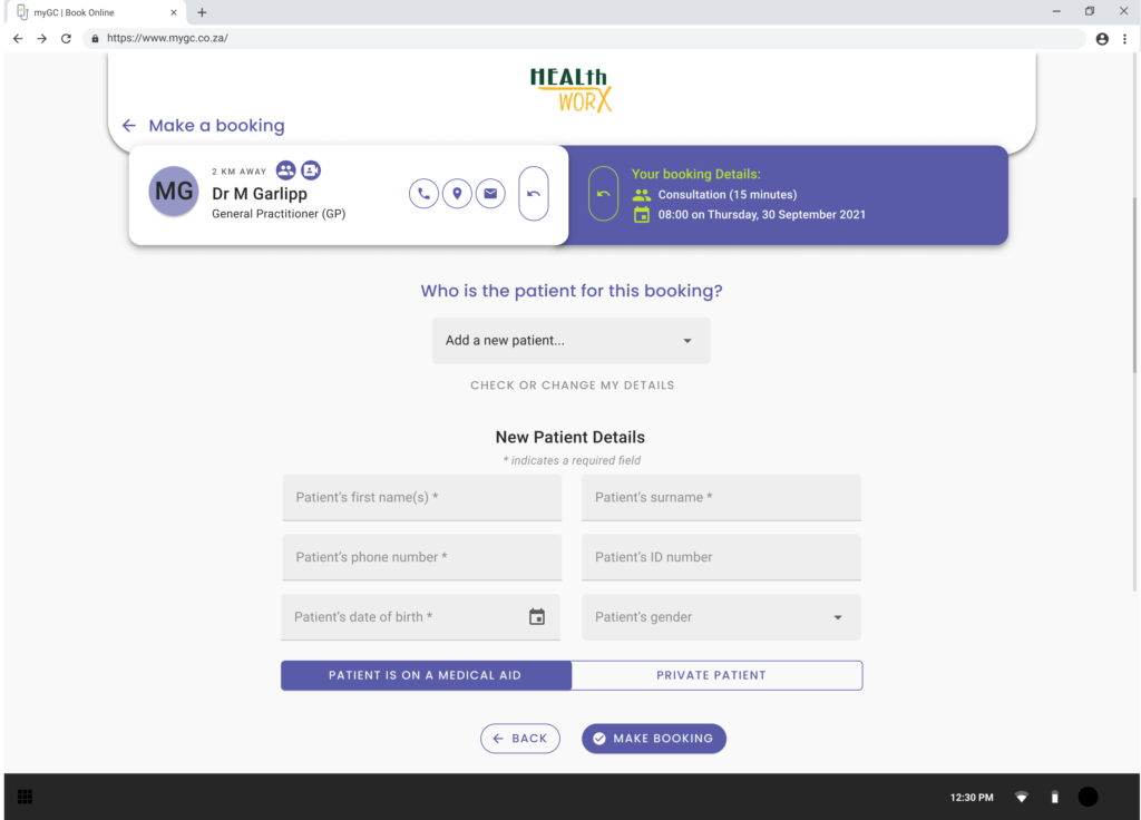
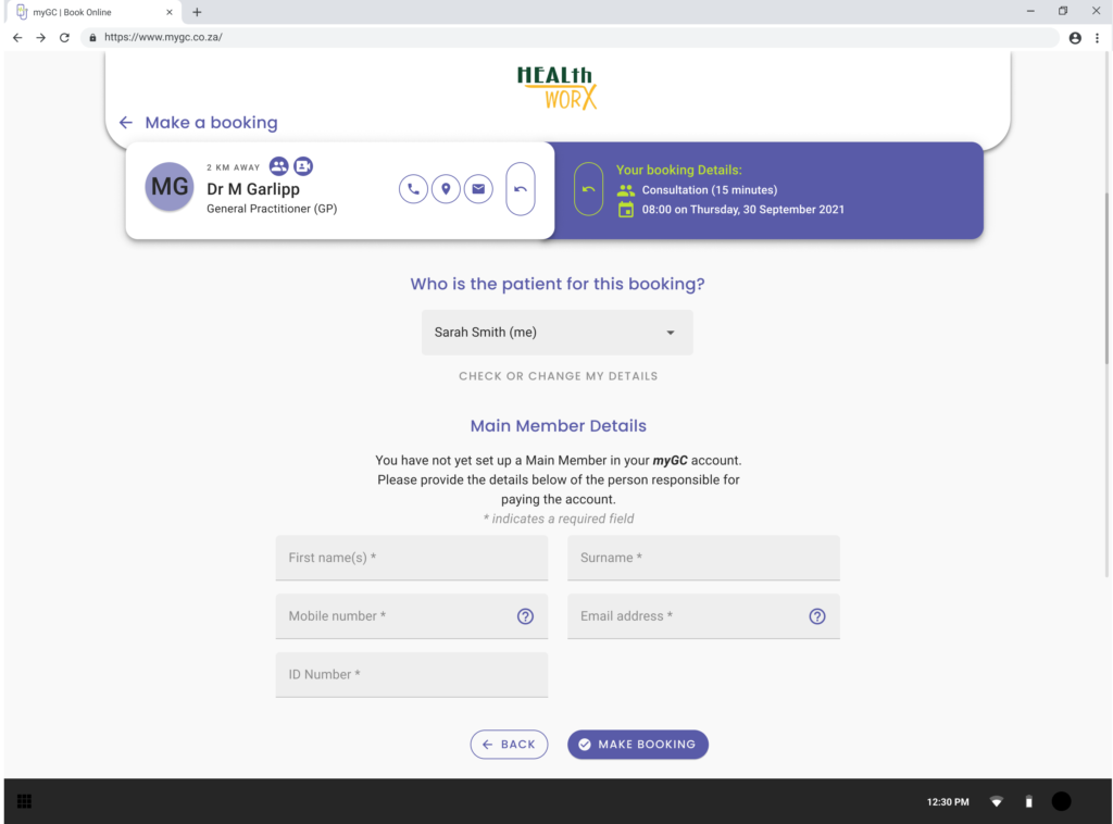
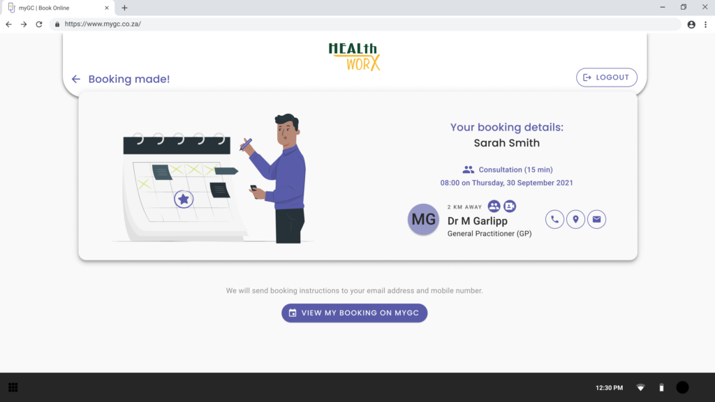
I linked the screens into a Figma prototype to check the logic held up and to walk stakeholders and developers through it before handoff.
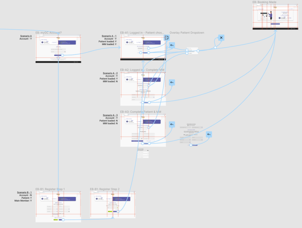
I couldn't run proper user testing on this before it shipped, time constraints on the fix ruled it out, so I checked the logic with the product owner, developer, and business analyst instead and handed it over.
The fix went live in December 2021. Average monthly ratings, which had sat below 4.2, held consistently above 4.3 afterward.
View the interactive Figma prototype
Dashboard page views increased 61.67% from 2020 (43,264) to 2021 (69,946), and a further 21.25% in 2022. I can't attribute that increase to the redesign alone. myGC integrates directly with GoodX's doctor-facing software, and a meaningful share of the growth came from doctors actively encouraging patients to use the app for records and communication, not from the redesign in isolation. What I can say confidently is that the app shipped, held up under real usage, and became the foundation later, more targeted improvements were built on, including the booking flow fix that followed in December 2021, which took average monthly ratings from below 4.2 to consistently above 4.3.
This was my first real end-to-end product design project and my first consumer-facing app. No usability testing happened before launch, something I'd push harder for now given the scale of the rebuild. There was no design system at the time, which showed up directly in the handoff: with around ten developers building simultaneously and no shared source of truth for spacing or type, small inconsistencies crept in even where I'd designed to pixel precision. I also learned what it actually takes to negotiate a design through a large dev team under time pressure, and to accept that some visual precision will always trade off against build speed at that scale.
The full 200+ screen handoff from the original 2020 redesign is viewable in Zeplin: zpl.io/bLQeZ1Y. That's a developer handoff reference, not a click-through prototype.
For an actual click-through experience, the booking flow fix above has a working Figma prototype you can click through.