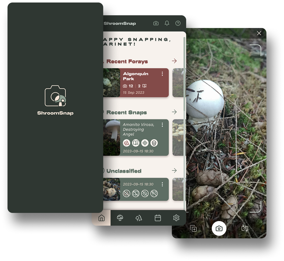
I've been mushroom hunting since I got a mushroom identification book for my birthday two years ago. Hunting, for me, means finding mushrooms in the wild, photographing them, and working out what they are myself, book in hand. When I went looking for an app to support that, I found plenty of identification apps that would tell me the answer, and almost nothing built for people who want to find it themselves.

Where's the fun in mushroom hunting if you can't identify them yourself? So I decided to design the app I couldn't find.


Project overview

ProjectShroomSnap, a personal mushroom hunting and cataloguing app
My roleSolo product designer, end-to-end: concept, wireframes, hi-fi screens, user flows
TeamNone. Personal project, self as the only user
TimelineSeptember 2025, ongoing
PlatformMobile app, Android-focused (web under consideration)
StatusAlpha scope wireframed and designed in hi-fi. Beta scope planned, not yet designed.

The problem

Every mushroom app I found solved the wrong problem. Most are identification apps: point your camera, get a species name back. That's useful if you just want an answer, but it skips the part of mushroom hunting I actually enjoy, working it out yourself against a field guide. I couldn't find a lean app that just let me photograph what I found, tag where I found it, and left the identifying to me.

There was also nothing simple for grouping a day's finds together. A hunt isn't one mushroom, it's a walk through a park or a woodland where you might photograph a dozen different specimens. I wanted a way to hold onto that context: what I found, where, and on which trip, without the app trying to be the expert.

Only take photographs. Harvesting isn't condoned, and the app opens with a clear reminder never to eat anything found in the wild, no matter how confident you or anyone else is in the identification. That's not a design flourish, it's a plain safety necessity for an app about mushroom finding.


What shaped it

As with my other personal projects, there was no formal user research here, no interviews or usability rounds. I looked at identification-first apps early on, when I started the project, and found the gap between "tell me what this is" and "help me record what I found so I can work it out" was consistently unfilled.

  • Identification apps skip the part I enjoy. Automated species matching removes the actual hunting from mushroom hunting.
  • Nothing simple existed for grouping finds by trip. A day's hunt in a specific park deserved to be captured as one unit, not a scattered camera roll.
  • Location capture needed to be automatic, not a chore. Manually tagging GPS coordinates for every mushroom is exactly the kind of friction that stops a habit from sticking.
  • Safety had to be unavoidable, not buried in a settings page. A reminder not to eat anything found in the wild needed to be one of the first things anyone sees.

Design process

Brand and concept

The concept is simple: capture, catalog, and classify your fungal discoveries. The brand had to match the activity itself, so I set it as beautiful, not sexy. Earthy, not formal. Adventurous, not sophisticated. Informative, not authoritative. Reflective, natural, and concise sit alongside those as supporting traits, an app that respects the quiet, observational nature of mushroom hunting rather than gamifying it.

The name is straightforward by design, an alliterative nod to the core action: snap a (mu)shroom.

Core structure

The app is organised around three connected ideas. A Snap is a single photographed mushroom, with its location captured automatically from the photo's metadata rather than tagged by hand. A Foray groups snaps together as a single trip, a park or trail hunted on a given day. Mushrooms is the catalogue view across every snap you've taken, foraged or not.

Community features, seasonal reminders, and workshop events are all part of the long-term vision, but they sit in Phase 2. Alpha is deliberately narrower: snap a mushroom, start a foray, and manage your own account and settings offline.

Wireframes and flows first

Before any hi-fi work, I mapped the two flows that matter most to how the app actually gets used day to day: Snap a Shroom, tracing the two entry points into the camera (swiping down from Home, or navigating to Mushrooms directly) through to completing metadata, and booking a spot on a Foray Event, which maps the full RSVP and payment path including failure states like a filled event or a declined payment.

I also broke the full feature set down into a task list before starting any screens, grouped by area (Forays, Shrooms, Community, Account, Settings, Help & Onboarding), which is what let me see clearly which tasks were genuinely Alpha and which were reaching into Phase 2 territory.

An open question: two colour directions

The hi-fi screens currently carry two different colour treatments that haven't converged yet. Splash, Login, and Sign up use a dark forest-green background with cream and blush accents, a moodier, arrival-moment feel. Home, Mushrooms, Forays, and Events use a lighter cream background with an olive header and rust accents, tuned for everyday, functional use. Both directions work on their own terms, and rather than force a decision without evidence, this is exactly the kind of choice a small round of user testing should settle.

An open question: where mushrooms sit in the flow

The wireframes and the hi-fi screens also disagree slightly on structure. The wireframes assume you start a foray first, then add mushrooms to it, with Mushrooms sitting central in the navigation to make that easy to reach. The hi-fi screens assume the opposite: quicker direct access to snapping and viewing mushrooms, since not every mushroom you find needs to belong to a foray. Both are reasonable models of how someone might actually forage, and it's another decision better settled with real usage than guessed at the design stage.


The solution

Home

Mushrooms: the catalogue

Forays: grouping a hunt

[Screen: Forays] Caption: Forays listed as trips, searchable, each showing how many mushrooms and notes it holds.

Snap: the camera flow

[Screen: Home & Snap wireframe] Caption: The full snap interaction, swipe down to open the camera, take the photo, tag it to an existing or new foray, and mark quick metadata like edibility and gill type before closing back out.

Events

[Screen: Events] Caption: Upcoming and past mushroom-hunting events, browsable by search, date, or name. Booking a spot is mapped in the user flow above but not yet built into this screen.


Outcomes and what I learned

ShroomSnap is earlier-stage than my other personal projects, and I want this case study to be honest about that rather than dress it up as more finished than it is.

What the project achieved: A scoped Alpha (Snap, Foray, Settings, Account, Walkthrough, Offline access) separated cleanly from a Phase 2 roadmap (notifications, public sharing, classification voting, a nearby map, messaging, and custom tags), backed by a full task breakdown and two mapped user flows before any hi-fi screens were drawn. Wireframes and hi-fi designs exist for the core Alpha screens: Home, Mushrooms, Forays, New Foray, View Foray, the Snap camera flow, Events, and account creation.

What I learned: I tried, early on, to build this app for real in an online app builder rather than just design it, and it sidetracked me. I got stuck trying to recreate my own styling while also wiring up functionality, and the project stalled. Stepping back to just design it, the way I approached Surmount, has been a far more honest use of the time I actually have for a side project. The two unresolved decisions in this project, colour direction and where mushrooms sit relative to forays in the navigation, are also a reminder that not every design question needs to be settled by opinion. Both are genuinely worth testing with real use before I commit either way.

Next up: resolving the colour and navigation questions, most likely through a small round of user testing, then designing the Phase 2 screens starting with the Foray Event booking flow already mapped above.


Interactive prototype

[No interactive prototype yet. Alpha screens are designed but not yet wired into a clickable flow.]

© 2026 Marinet Garlipp. All rights reserved.