Seeing something wonky on the site? Sorry about that, it's new. I'm working on it...

hello world!
Surmount Habit App
Designing the habit tracker I couldn't find: one that rewards effort, not just completion.
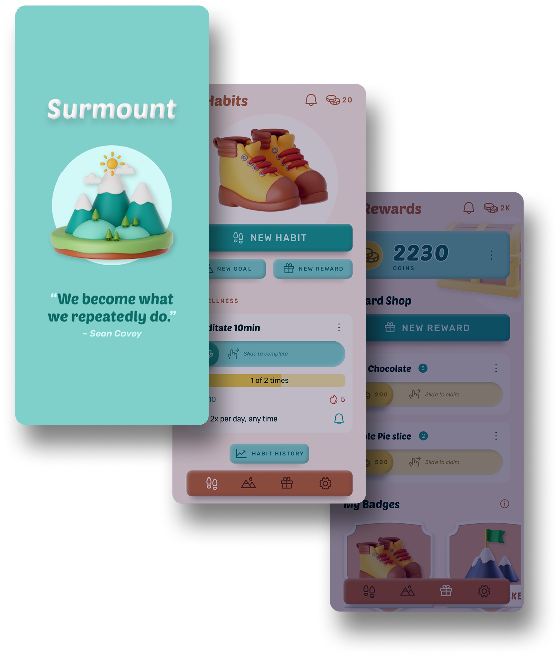
Designing the habit tracker I couldn't find: one that rewards effort, not just completion.
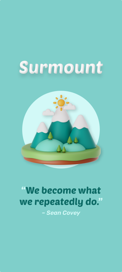
"We become what we repeatedly do." — Sean Covey
I wanted to run at a specific time of day. In summer, the ideal window is early morning, while it's still cool. That's also the hardest time to actually get up for. Sleep in a little and it's a late morning run in the heat. Procrastinate further and it's a 5pm run in the worst of the day's sun.
Every habit app I tried rewarded the same thing: did you do it, yes or no. None of them cared when I did it, or what it cost me to show up. A 5am run and a 5pm run earned identical credit, even though only one of them actually took discipline. So I designed the app I wanted to use.
| Project | Surmount, a personal habit tracking app |
| My role | Solo product designer, end-to-end: concept, wireframes, hi-fi screens, prototyping |
| Team | None. Personal project, self as the only user and tester |
| Timeline | March 2025, ongoing |
| Platform | Mobile app, Android-focused (web under consideration) |
I found one app that did track effort by time window. Its interface was dull enough that I stopped opening it within a week. Everything else on the market fell into the same trap from the other direction: Habitica, which leans so far into gamification that habit tracking becomes secondary to the game itself.
The gap wasn't a missing feature. It was a missing feature built with any craft. Most habit and productivity apps also default to an authority voice: streaks that guilt you, notifications that nag, penalties dressed up as motivation. I wanted the opposite. The carrot, not the stick.
This is a personal project built for an audience of one, so there was no formal user research, no interviews, no usability testing round. What I had instead was direct, daily friction with the problem, and an informal read of the field.
Before any screens, I set the brand as a filter for every decision that followed. Surmount had to be adventurous, not staid. Considerate, not irritating. Casual, not formal. Supportive, not authoritative.
The name carries a double meaning that the whole visual language builds on: surmounting yourself, the internal effort of building a habit, and reaching the peak, the external goal that habit is in service of. That gave me a mountaineering and camping theme to work with (binoculars, hammocks, hiking boots, flags on summits) that reads as adventurous and earthy without tipping into twee.
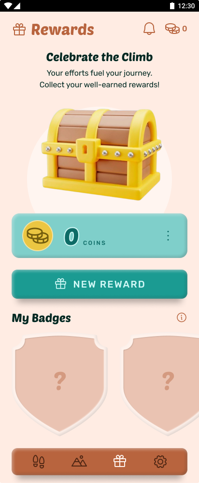
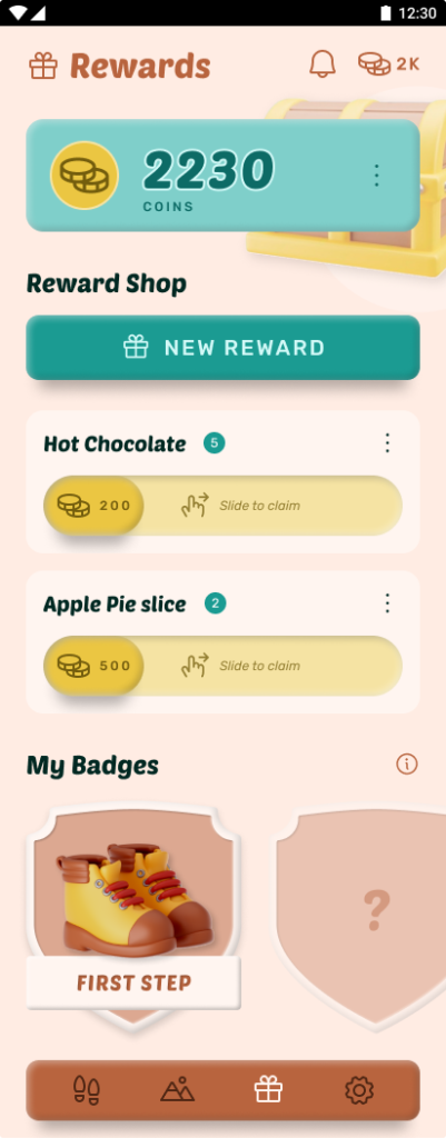
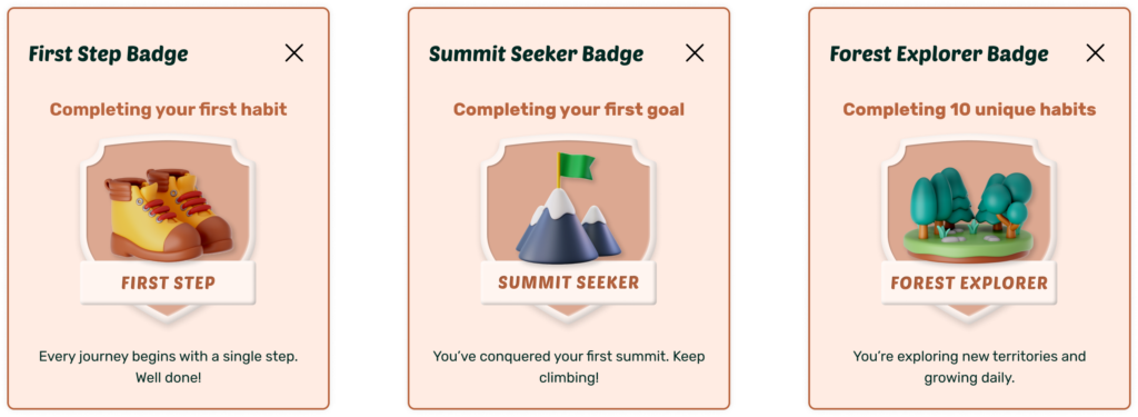
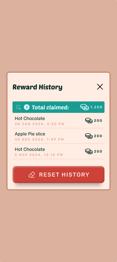
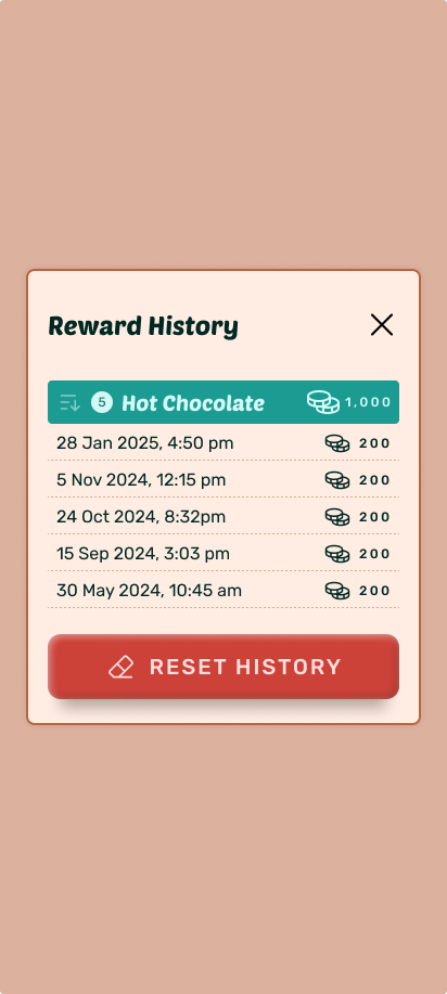
The system is built from four connected pieces: Habits, the daily or repeated actions you're tracking. Goals, the summit each habit is climbing toward. Rewards, self-defined prizes you purchase with earned coins. Badges, milestone recognition that triggers automatically.
The mechanic that started the whole project lives in how a Habit is rewarded. When you create one, you set your own coin value per completion, which means the same habit can be worth more or less depending on how you personally weight the effort. An early morning run can be set to pay out more than a late afternoon one, even though both count toward the same goal.
Almost every hi-fi screen started life as a wireframe first, annotated with the logic behind each decision: which fields are optional, which fields branch into further choices, priority notes on edge cases like a habit only being able to belong to one category but multiple goals.
Alongside the wireframes, I mapped the more complex flows as proper user flow diagrams before touching visual design, tracing every decision point (does it have a category, is it part of a goal, set a reminder or not) through to the save action. That groundwork is what let the hi-fi screens stay lean: the branching logic was already resolved before I opened a single high-fidelity frame.
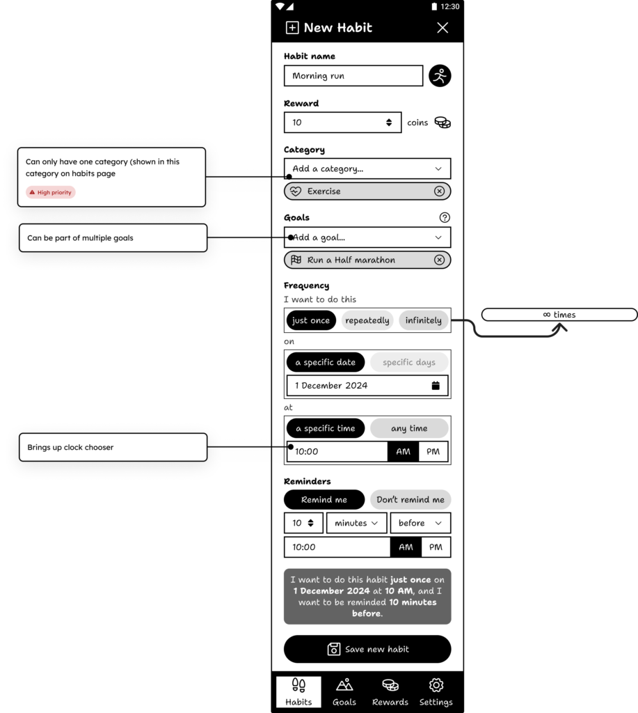
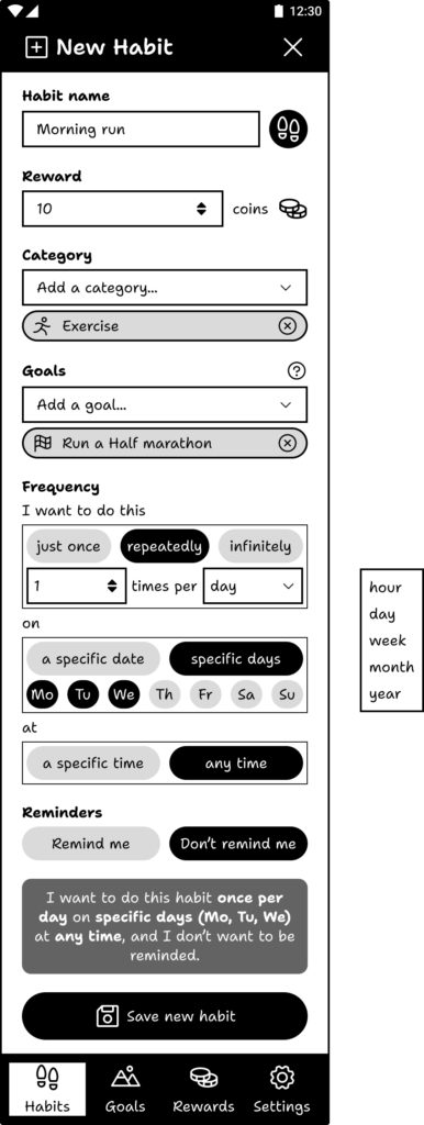
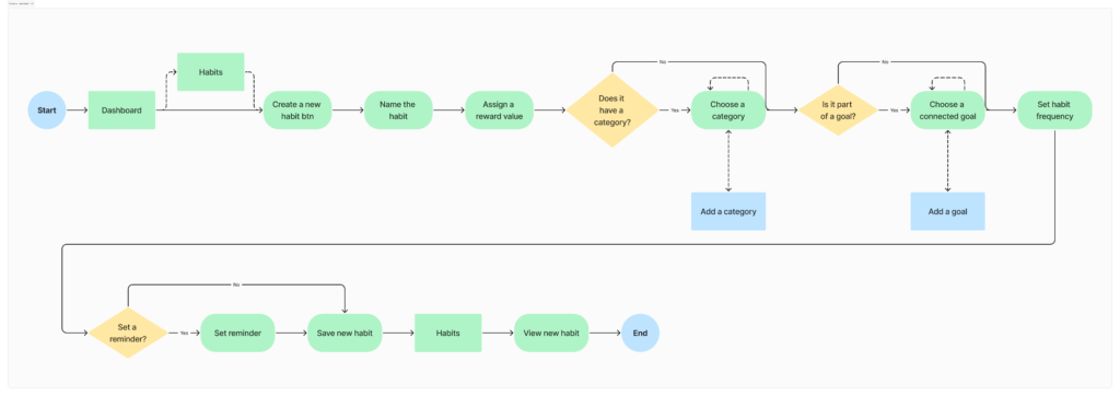
The New Habit flow reflects the low-threshold standard directly. Naming and an icon come first, reward value next, then an optional category and goal link. Frequency is built as a plain-language sentence that updates live as you choose ("I want to do this habit twice per day on specific days at any time, and I want to be reminded 10 minutes before"), so you can see exactly what you're setting up before you save it, rather than trusting a summary screen after the fact.
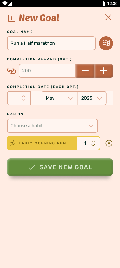
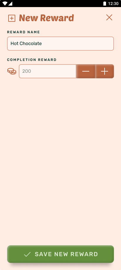
New Goal exists in two places: as a full page when you start from the Goals tab, and as a modal when you're mid-flow creating a habit and want to link it to a goal you haven't made yet. The modal means you never have to abandon a habit you're building just to go set up its goal first, you create both in one pass. New Reward and New Category follow the same lightweight-modal logic, quick, single-purpose additions that shouldn't interrupt whatever you were already doing.
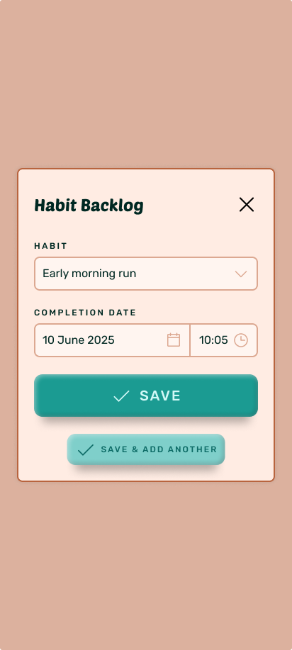
For logging the past, I added a Habit Backlog modal, since real habit tracking isn't always logged the moment it happens. It lets you record a completion against a past date and time, with a "save and add another" option for catching up on more than one entry at once.
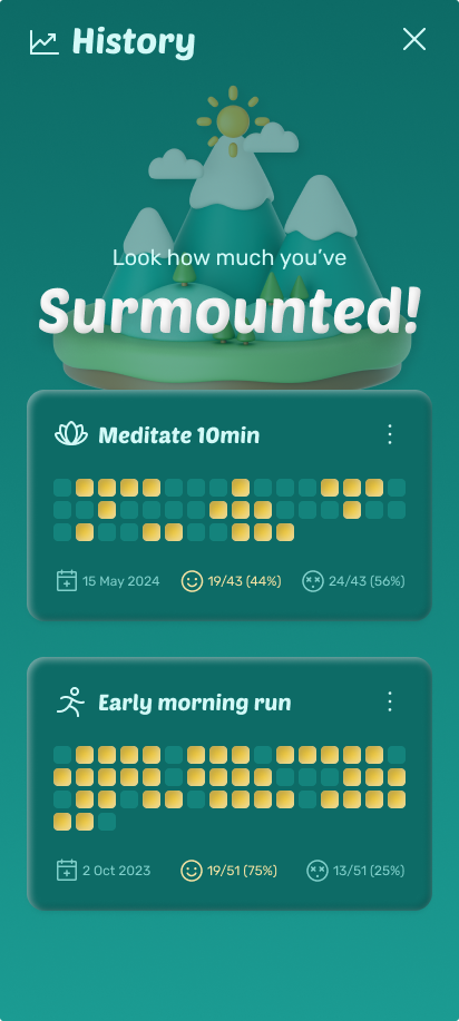
History turns tracked data into something worth looking at. Each habit gets a heatmap-style grid of its completions, alongside on-time versus late-completion percentages, so the time-of-day mechanic that started the project is visible at a glance, not buried in a log.
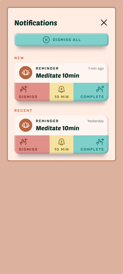
Notifications are deliberately quiet. Reminders surface as dismissable cards rather than persistent badges or red dots, and the empty state ("No new notifications") is treated as a real, designed screen rather than an afterthought, in keeping with the gentle-reminder-not-irritating-prodding brief.
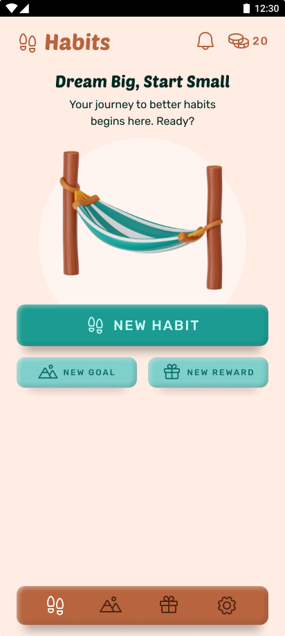
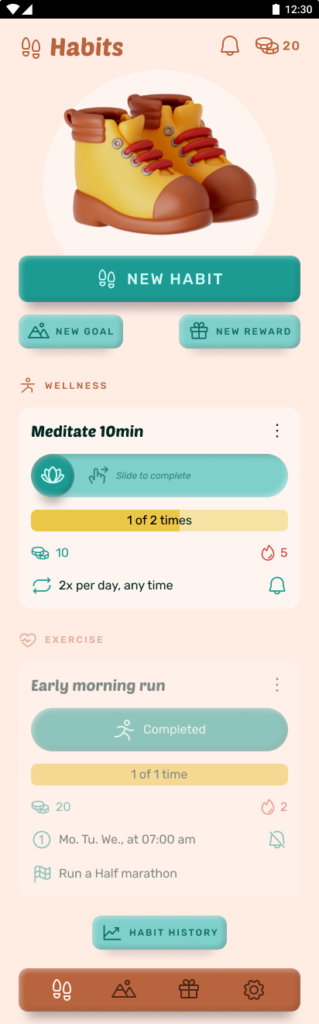
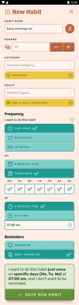
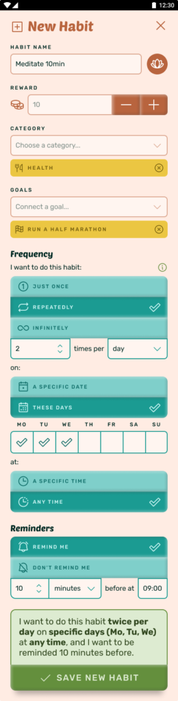
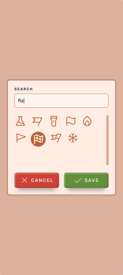
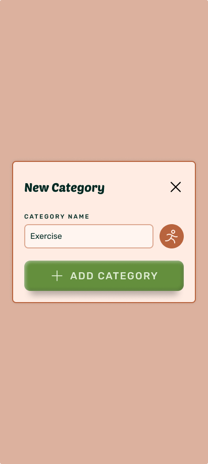
Naming, icon, reward value, category, goal link, and a frequency sentence that reads back what you've just set up, all in one uninterrupted pass.
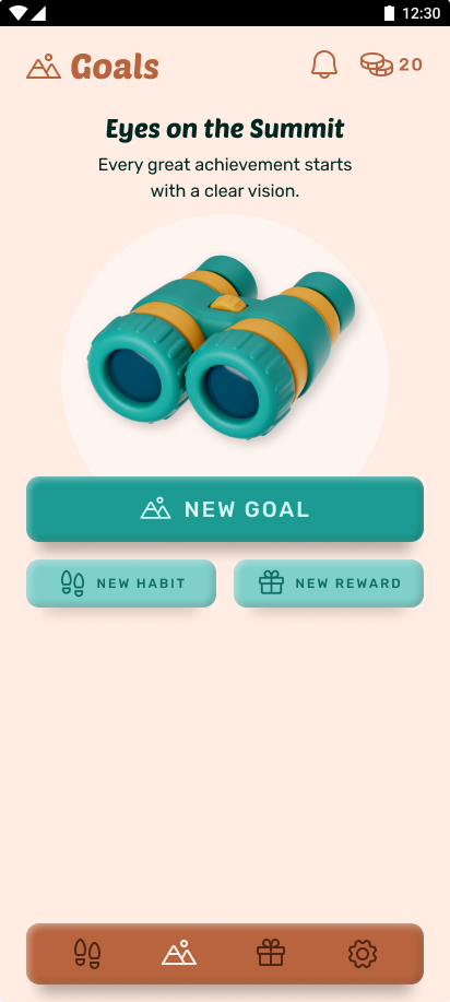
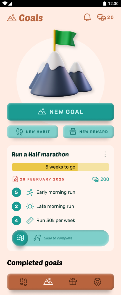

Surmount hasn't shipped, so there are no usage numbers to report here, and I'm not going to invent any.
What the project achieved: Full wireframes and user flow diagrams for the core creation flows, followed by complete hi-fi screens across Habits, Goals, Rewards, Settings, and every supporting modal. A full set of badges already designed and defined. An on-demand help function, triggered only when asked for rather than forced on first open, is scoped but not yet designed.
What I learned: Designing for an audience of one is its own kind of constraint. Without user interviews to fall back on, every decision had to survive daily use against my actual habits, a slower feedback loop than a research sprint, but a genuinely honest one. It's easy to describe "reward effort, not just completion" in a sentence. Building the actual input, a single coin value a user sets per habit, without it turning into a settings maze, took several passes before it felt as low-effort to configure as the rest of the app.
Next up: finishing the interactive prototype in Figma, then testing the time-window reward logic against a few weeks of my own real habit data. Ideally I'd like to use a top-of-the-line paid-for AI coder to create the app and maybe even take it to market.
Monetisation option: since it's more a personal project and need, monetisation was not really something I considered. However, with the AI craze I thought a good monetisation would be if the built-in AI could take your data (with consent, of course) and propose how you could improve or tweak your habits to better reach goals. There might be other directions this monetisation or AI could take, but in order to keep the app to its core values this would be the first feature I'd do user research on.
Prototype still in early stages in Figma and will be added here once ready.